Ease of use, responsive design and a cohesive information architecture are all aspects of a great website. However, in today's digital world, it can be difficult to maintain an amazing website that incorporates the latest design and development components that seem to be created on a monthly basis.
Updating your site to reflect every new technology or design trend is unrealistic. If you tried to accomplish this, your website would undergo updates so frequently that it may confuse your regular visitors and it will surely tie up your design and development teams.
However, it is important that you update your site on a timely basis. Implementing a few strategic bells and whistles can improve your sites overall ease of use, responsiveness, and information architecture. With that being said, here are five ways to modernize your site.
1. Responsive and Bold Headers
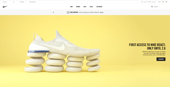
A photo is worth a thousand words, so why use excessive amounts of copy when a big, bold and responsive image can communicate your message with little to no text? Looking at medium.com and nike.com, you can see how the right headline and image can impact your website. Both of these sites are able to quickly promote their message, and with responsive coding, everything will look great no matter what size device their visitors are using.
2. Hamburger Menus
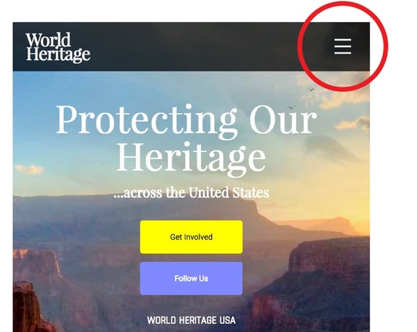
Whether you call it the hamburger, a navigation drawer, or tri-bar, the condensed mobile menu icon is something you should consider. Made famous by Facebook and countless mobile apps, the hamburger menu saves valuable real estate in the header and reduces clutter. Instead of having a full menu that becomes almost impossible to read on a smartphone, hamburger menus allow your user to control when they want to see a menu no matter what device you are using. You can see an example of a hamburger menu in the upper right-hand corner of the world heritage site we made for US/ICOMOS above.
3. Semi-flat Design
Semi-flat or flat design elements can make your site look and feel very modern, sleek and sophisticated. This type of design stems from Apple's flat design, which is centered around taking the depth out of three-dimensional objects. This type of design takes real objects and renders them two dimensional.
Now, the edgier, more modern take on flat design is a semi-flat design, which you can see examples of throughout triplagent.org:
.png?width=700&name=Screen%20Shot%202018-02-07%20at%2011.15.26%20AM%20(2).png "Semi-flat design example from triplagent.org")
Semi-flat designs follow the same approach as flat design, but depth is introduced by adding a few instances of shadowing to images. Semi-flat designs benefits extend beyond aesthetics. The absence of complex, large, and bulky images will help your site load faster when visitors navigate to and around your website.
This versatile style plays nicely with color, image and icon systems, which can improve navigation and add context to specific sections of your site. Brand recognition and design go hand-in-hand; if you are using a modern design to display your products or services on your site, social platforms, and blog, this design will surely help you stand out.
4. Card Design
The popularity of card designs can be widely attributed to the acceptance of Pinterest, which is the site that really brought this design into the mainstream. This type of design is now being used more frequently in not only B2C but also B2B businesses. This may seem strange if your company is mainly focused on B2B sales, but this design makes choosing and digesting information very easy for your website's users. If someone visits your site and is looking for either something specific, or is unsure of what they are looking for, card designs make selecting content easy. This, in turn, keeps your users happy because they are able to navigate and locate what they are looking for, without getting bogged down by content three or four clicks into your site.
Examples of card design can be found everywhere now. Take a look at Polaroid's site to see how this design and organization strategy creates a simple UI that can be navigated quickly and easily.
-1.png?width=700&height=614&name=Screen%20Shot%202018-02-07%20at%2011.35.07%20AM%20(2)-1.png)
5. Standout Typography
One of the best ways to create a modern feel throughout your website is by selecting the right type treatment. Your choice of typeface should be carefully considered throughout your site's body copy, h1, and h2 styles and even with your header images. Selecting the right font for your site should never be overlooked. You want to select a font family which matches the rest of your site's look and feel to create the best possible user interface. There is nothing worse than visiting a site that has amazing imagery, functional layout, but a typeface which doesn't match the design.
One place you can look to for inspiration is Font Shop. This site has many different modern and standout fonts types for download.
-1.png?width=700&height=638&name=Screen%20Shot%202018-02-07%20at%202.09.27%20PM%20(2)-1.png)
When choosing fonts for a website design, work with web developers to define back-up fonts in case a visitor’s browser security settings prevent your desired font from loading. This list of typeface fallbacks is called a ‘font stack.’
Need a New Look?
Not every company has the manpower, hours or skills necessary to create a sleek, modern website—and that’s OK. If you’re in need of a new site, or want to consult with someone to make sure the steps you are taking are the right ones, contact us! We have more than 20 years of web design and development experience, and would be glad to talk to you about your site and the goals you have for it.
Subscribe to our blog or follow us on social media for more tips on web development and design trends.