In today’s marketing climate, where ecommerce sales now account for more than 9% of total sales, your website has the potential to be your most powerful asset. Whether on desktop or mobile, if you want to attract and convert customers, a positive user experience (UX) is crucial. As technology advances and consumer expectations begin to change, your website may feel outdated and difficult to navigate. At some point, a website redesign or refresh becomes necessary.
Before we go any further, it’s important to define user experience, or UX. UX focuses on your users’ needs, values, and limitations in relation to a product. A user’s experience on your site is determined by how they interact with it from start to finish. This means that when you optimize your site for usability, you should put special emphasis on how people naturally interact with websites.
To determine the usability of your site, ask yourself 4 questions. Use these questions as a checklist to see if your site is as user friendly as it can be.
How useful is your site?
The usefulness of your site is the foundation for which everything else is built on. Satisfying the sequential aspects of user experience will become unnecessary if your user isn’t able to accomplish the task that brought them to the site. While measuring this may depend on the context, putting your users’ needs and experience first is vital for a positive user experience.
Tips for improvement: Create a list of actions that you would like your users to take. Next, do your own informal testing by asking a few people to find specific content on the site. If they are able to find the content easily, you are on the right path. If they struggle, you may need to rethink your strategy. This exercise will help uncover issues that can adversely affect the ease-of-use and overall effectiveness of your website.
How simple is your site?
Usability addresses ease of use and the simplicity of your interface. A usable website is understandable and familiar to the user, even if they’re a first-time visitor. The user needs to be able to navigate your website efficiently to find information about your product or service. This not only leads to positive UX, but builds trust in your brand and increases user satisfaction.
Tips for improvement: Reduce your users’ cognitive workload whenever you can. Be consistent, clear, and establish a visual hierarchy. Depending on your business, your navigation should reflect the different services you offer or different reasons for using your site. A cluttered navigation bar can make the user confused in their search.
How accessible is your site?
Much like usability, accessibility requires that your website can be easily used by all potential users, including people with disabilities. A site that is designed for the vision and hearing impaired helps all users easily access and view the information on your site.
Tips for improvement: U.S. Department of Health & Human Services outlines several best practices when creating digital content that’s accessible for all visitors. They include:
- Do not rely on color as a navigational tool or as the sole way to differentiate items
- Images should include Alt text in the markup/code; complex images should have more extensive descriptions near the image (perhaps as a caption or descriptive summaries built right into a neighboring paragraph)
- Functionality should be accessible through mouse and keyboard and be tagged to worked with voice-control systems
- Provide transcripts for podcasts
- If you have a video on your site, you must provide visual access to the audio information through in-sync captioning
- Sites should have a skip navigation feature
- Consider 508 testing to assure your site is in compliance
Improving your site’s accessibility also benefits your mobile web design and SEO. According to case studies completed by Web Accessibility Initiative, accessible websites have better search results, reduced maintenance, and better reach.
How engaging is your site?
So far, we’ve covered the rational aspects of UX, but desirability relates to emotional appeal of the user. Yes, usefulness and usability are important as the base of user experience, but if your website doesn’t leave a lasting impression on the user, it’s unlikely that they will return or recommend the site to others. Whether viewing on desktop or mobile, your site should make the user feel something. Desirability isn’t just about a pleasing interface, it’s about encouraging the user to engage in their use of the website.
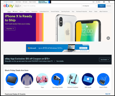
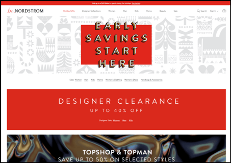
Tips for improvement: You can evoke emotion by clearly communicating your brand identity through design. Take into account your brand’s goals while applying visual design principles to your interface to help leave a lasting impression. To get a better understanding of this balance, let’s compare Nordstrom and eBay’s website homepages:


After comparing these two homepages, Nordstrom may appear to be more engaging and desirable. However, this may not be the case. eBay is designed to pull users into the latest deals and drive them to search for listings. Both sites allow for their users to navigate and locate what they are looking for, even though they are two very different looking sites. By keeping the user in mind, your design will lend itself to the audience you are pursuing and create a more efficient website.
The polished design of Nordstrom’s home page suggests their high-end inventory, something that eBay’s visitors aren't necessarily interested in. To sustain its desirability, eBay is better off utilizing a more functional design that stays true to their business: online auctions.
Is it more important for your web site to be desirable or accessible? How about usable or credible? The truth is, it depends on your unique balance of content, your users, and if the required tradeoffs are better made explicitly than unconsciously.
Written December 26, 2017 by
Sophia Aguirre
Intern at A+T and soon-to-be university graduate. Creative contribution: somewhere between Don Draper and Dick Whitman.