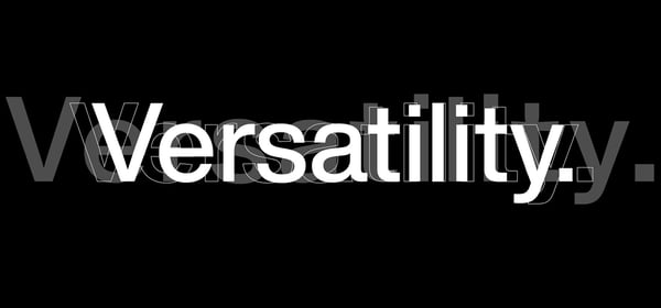
Helvetica
Helvetica is one of, if not the, most well-known typeface in the world. Created in 1957 by Max Miendinger, its goal was simple: a clean and legible appearance with no additional stylistic flourishes to influence the text’s message. Clearly Miendinger succeeded—Helvetica has since been used so frequently by numerous governments and private businesses that all but the most remote viewers have doubtlessly been exposed to it. (This cultural significance was even the subject of a 2007 documentary, also named Helvetica, that further increased its fame.)
Yet for all its virtues, Helvetica does have its quirks. Its spacing at large and small sizes suffered from being converted to the digital version, requiring manual letterspacing correction for optimal legibility. Its alternative options can, at times, be limited. And its popularity has resulted in a wide variety of weights and alternative versions, such as Helvetica Neue, that can lack consistency or even appear strange.
Charles Nix and his team at Monotype sought to address these problems with Helvetica Now, a font family available in three versions:
- Text, for most scenarios with large amounts of text
- Display, for large applications such as headlines
- Micro, for increased clarity on particularly small screens (i.e., the Apple Watch)

All three versions offer multiple weights, in standard and italic styles, for a total of 48 options touting unique character design. Nix also sought to restore some flexibility to the typeface; all versions of Helvetica Now offer:
- Simpler, more angular alternative versions of select letters
- Alternate punctuation designed with rounded edges
- Entirely new modern characters, such as the Bitcoin symbol
- A corresponding set of arrow icons
- Additional circled or squared numeral treatments
Each of the approximately 40,000 characters available has been entirely redrawn and optically scaled—a labor of love that has taken Nix and his team two years.
Monotype is currently offering a free sample weight; the full font family can be purchased on MyFonts.com or by contacting the Monotype sales department.
Written July 9, 2019 by