Did you know that according to the World Health Organization, more than 200 million people around the world have some type of visual impairment? Be it colorblindness, eye injuries, cataracts, or reduced vision that naturally comes with age, these challenges can make it more difficult for people to read text presented in certain color combinations.
Color Contrast and Legibility
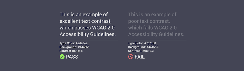
Color contrast—the degree to which lettering stands out from its background—can be measured. Put simply, the higher the text's contrast, the easier it is to read. When Alexander & Tom, Inc. creates websites, mobile apps and other digital interfaces for our clients, we strive for high-legibility visual design, which gives a better reading experience for anyone with less than perfect vision.
Designing for legibility is not only good practice, but when designing for government-sector clients, it's the law! Text on government websites is required to meet or exceed certain thresholds prescribed by the W3C’s (World Wide Web Consortium) Web Content Accessibility Guidelines.
Example of Color Contrast
If you'd like to read more about text and color contrast, check out these links: